Bar / Restaurant Menus
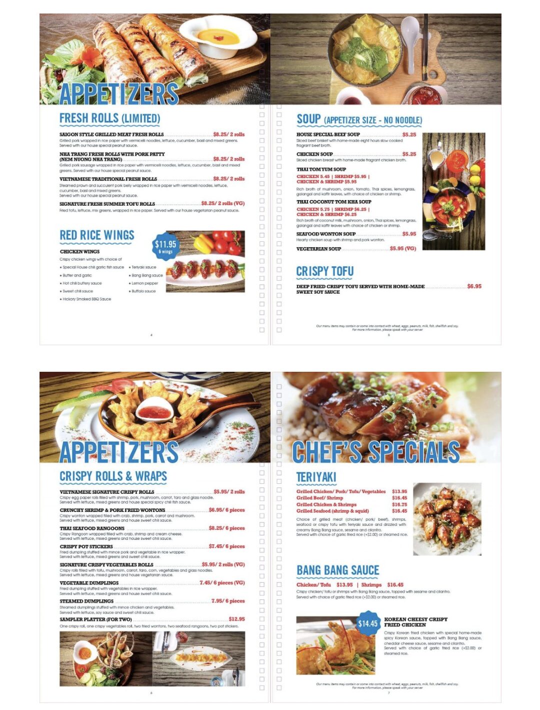
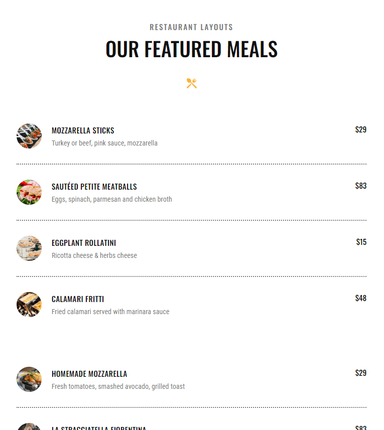
Restaurant owners and managers do not often stop to think about the readability challenges and other frustrations that a PDF or an image version of a menu brings to their guests, and the potential impact this can have on their business. They don’t stop to think about the challenges and frustrations that a PDF version of a menu brings to their guests. Which would you rather read?

– OR –

Having your restaurant menu displayed as only PDF or an image on your website is bad for you and bad for your customers. So why do so many restaurants do it? Let’s take a look at three reasons why having your menu as a PDF or image costs your business customers and, ultimately, revenue.
1. It’s a bad experience for your customers.
Studies have shown that PDFs are ineffective for reading on a phone. The screen size is significantly smaller than the desktop computer the pdf was designed on. The images and fonts are effectively reduced by up to 66% of the original format. This means that the 12 point font used in the pdf effectively becomes 4 point text… mice type/illegible. Yes, your customer can zoom in and out to try to read easier, but why would you make it difficult for them to begin with??
They could also scroll from side to side to read your dish’s description, but again… Why would you do that to them?
A mobile menu is designed to fit all of the information in the phone screen in a size and that is comfortable to the reader. A mobile menu adjusts the font sizes and the line lengths so that they can be read on the phone. Instead of having to zoom and scroll, a mobile-friendly menu needs only to be scrolled through vertically.
2. Optimization for individuals with visual impairment and other disabilities
While viewing a menu on a small screen may sound mostly like no more than a mild nuisance, it is actually a serious issue for people with disabilities. About 15% of the world’s population lives with some form of disability. Many individuals often have to rely on technology such as magnifiers and screen readers to help them to read documents. There are many steps that must be taken to turn a regular PDF into an accessible PDF. While it is possible to optimize a menu for reading by people with disabilities, it takes time and effort that many restaurant owners and managers do not have. With digital menus becoming the primary version of the menu for many restaurants who are moving away from physical menus, this must be prioritized from an accommodation standpoint, as well as from a legal compliance standpoint.
In contrast to a PDF, a mobile-friendly menu is able to accommodate these compliance issues and is much more accessible to individuals with disabilities. The size of the text can be adjusted, and screen readers can easily read items out loud, and even read the alternative text to the images.
3. Reduced exposure to ADA compliance lawsuits.
Failure to make your website and menus accessible for people with disabilities can expose your business to a digital ADA lawsuit. $$$$
It’s definitely a wise investment and cheaper to make your website and menus compliant than defending a lawsuit.
Fun Facts
Or not so fun… Here’s some statistics regarding digital ADA lawsuits in 2021.
Web accessibility lawsuits filed in 2021 (up 14.3% from 2020)*
States have the highest rate of lawsuits (New York, California, and Florida)**
%
